
The code to plot the Lift Curve in Python
This little code snippet implements the function which allows you to plot the Lift Curve in Machine learning using Matplotlib, Pandas, Numpy, and Scikit-Learn. If you don’t know what it is, you can learn all about the Lift Curve in Machine Learning here.
Lets get to it and check out the code!
# Function that plots a Lift Curve using the real label values of a dataset and the probability predictions of a Machine Learning Algorithm/model
# @Params:
# y_val: real labels of the data
# y_pred: probability predictions for such data
# step: how big we want the steps in the percentiles to be

# imports
import numpy as np
import pandas as pd

def plot_lift_curve(y_val, y_pred, step=0.01):

    #Define an auxiliar dataframe to plot the curve
    aux_lift = pd.DataFrame()
    #Create a real and predicted column for our new DataFrame and assign values
    aux_lift['real'] = y_val
    aux_lift['predicted'] = y_pred
    #Order the values for the predicted probability column:
    aux_lift.sort_values('predicted',ascending=False,inplace=True)

    #Create the values that will go into the X axis of our plot
    x_val = np.arange(step,1+step,step)
    #Calculate the ratio of ones in our data
    ratio_ones = aux_lift['real'].sum() / len(aux_lift)
    #Create an empty vector with the values that will go on the Y axis our our plot
    y_v = []

    #Calculate for each x value its correspondent y value
    for x in x_val:
        num_data = int(np.ceil(x*len(aux_lift))) #The ceil function returns the closest integer bigger than our number
        data_here = aux_lift.iloc[:num_data,:]   # ie. np.ceil(1.4) = 2
        ratio_ones_here = data_here['real'].sum()/len(data_here)
        y_v.append(ratio_ones_here / ratio_ones)

   #Plot the figure
    fig, axis = plt.subplots()
    fig.figsize = (40,40)
    axis.plot(x_val, y_v, 'g-', linewidth = 3, markersize = 5)
    axis.plot(x_val, np.ones(len(x_val)), 'k-')
    axis.set_xlabel('Proportion of sample')
    axis.set_ylabel('Lift')
    plt.title('Lift Curve')
    plt.show()
Lets check out the parameters to see what they each mean in detail:
- y_val: array containing the real labels of the data.
- y_pred: array containing the probability predictions for such data. Important: These predictions are not the binary 0 or 1s, but the probabilities calculated using the predict_proba sklearn function (this example is for an SVM but most models have it) or other similar ones. model_probs is an array of probabilities like [0.82, 0.12, 0.34,…] and so on.
- step: how big we want the steps in the percentiles to be. By default this value is set to 0.01
Note: Both arrays y_val and y_pred should be calculated using the test data. Never use training data to calculate a machine learning evaluation metric/plot. You can learn all about evaluating machine learning models in this article.
It is also important to know that the y_val and y_pred arrays must have the same length for the code to work.
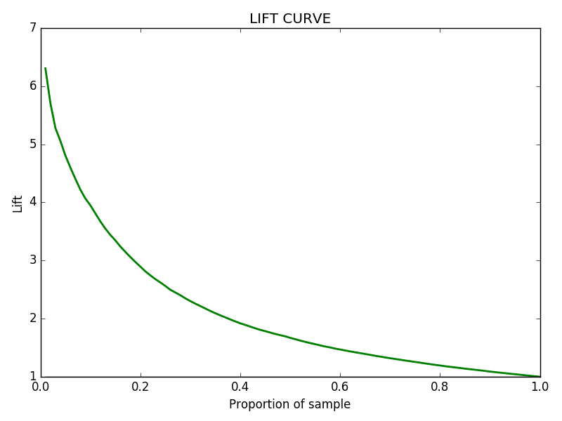
After you execute the function like so: plot_lift_curve( y_test , predictions ), you will get a figure like the following with the Lift Curve chart:
That is it, hope you make good use of this quick code snippet for the Python Confusion Matrix and its parameters! Follow us on Twitter here! Also, if you have any doubts or comments, please feel free to contact us at howtolearnmachinelearning@gmail.com.
Spread the love and have a fantastic day 🙂
No products found.
Tags: Code Snippet, Lift Curve Python Code, Model Evaluation, Matplotlib.
Subscribe to our awesome newsletter to get the best content on your journey to learn Machine Learning, including some exclusive free goodies!
