

A practical step by step guide to getting insights from data

Exploratory Data Analysis (EDA) is usually the first step of any Data Science project, carried out before any Machine Learning models are built. Its goal is to take a look at the raw data that we get, explore it, and gather insights from it that can not only help us make our models better after-hand, but also provide relevant business information derived from this data.
In this post we will carry out an extensive Exploratory Data Analysis on a real Data-Set in order to learn what can be done, how to do it, and practice our skills. Exploratory Data Analysis is mainly based on plotting and drawing different charts to derive relevant information from them.
While this might seem easy, it is important to know when to use each of the visualisation tools at our disposal, and what are the best practices to display de available information.
It is also important that we learn how to look deep into our data, so that we can tell a story using it that will captivate our listeners and provide valuable, usable information.
For it, we will use a real public data set, and cover all the different steps that we will use to do a preliminary data analysis of it, explaining as we go the strength and weaknesses of each plotting tool that we use. Lets go!
The Data: UCI Bank Marketing Data-set

The data- set that we will use is the publicly available ‘Bank Marketing Data Set’ , from The UCI Machine Learning Repository, which is a collection of databases, domain theories and data generators that are used by the machine learning community to test their algorithms.
The data is related with direct marketing campaigns of a Portuguese banking institution. These marketing campaigns were based on phone calls. In the previous repository you can find a description of all the variables. Lets quickly see what the data contains using three simple pandas functions:
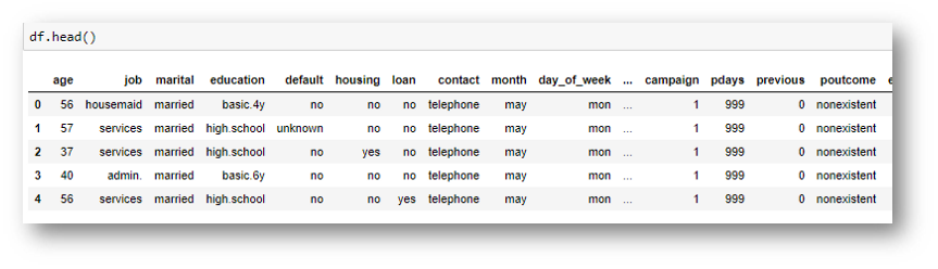
- Head: Using the head pandas Method lets us see the first 5 rows of our data. By doing this we can quickly see the variables that we have, some of their possible values, and if they are numerical or not.
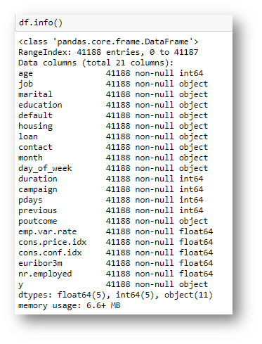
- Info: The info method is another way of getting quick and relevant information. Using it we can see how many data points and features we have, along with the data types of these features and if they have any missing values.
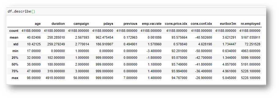
- Describe: The describe function is mainly use to get information about the numerical variables of our data set. You can see the mean, maximum and minimum values of each of these variables, along with their standard deviation. Some cool information can already be learned from here.
Okay, now that we have done a quick descriptive analysis, lets get on with what we came here for: the plots, how to tell a story with them and get relevant information.
The Exploratory Data Analysis: Plots and more plots

After doing this quick analysis with Pandas to see the amount of data points and the number of features that we have, along with their types and amount of missing values, we got a very quick overview of the size of the data that we are working with, its complexity, and the work that we need to do to fill in these absent values. Now, we will start the visualisation part of the analysis.
No products found.
In the following analysis we will go step by step paving the road we would use to get from our initial ignorance about our data to a deep knowledge of it, developing an understanding that should be enough to answer the most relevant questions that could be asked. Along this path, we will use different kinds of plots, each of which will be explained using an specific example, covering the best practices for using each kind of plot.
We will start by analysing the target variable. In the case of our data, this variable is clearly defined, and because it is a binary classification task, we already have an idea of what it should look like. We will do this using bar charts. Lets take a look!
Bar charts: visualising quantities associated to different categories

Bar charts are the bread and butter of exploratory data analysis, and represent a numerical quantity on one of the axis and different categories in the other one. They are generally used to compare a single numerical value between different groups or categories. In the following case we compare the proportion of samples for the different categories of the target variable.
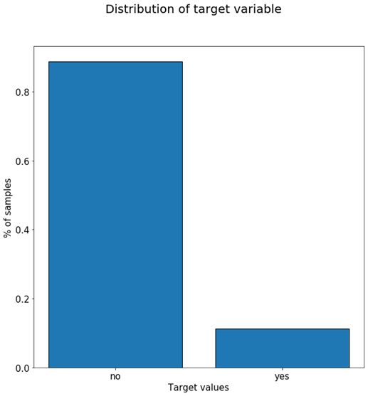
As we can see from the previous plot, more than 85% of our samples have a ‘no’ target value and about 12% have a ‘yes’ value. This initial plot gives us an insight to how customers react to our marketing campaigns (most decline) and also tells us that we might need to re-balance the data set if we plan to train a Machine Learning model afterwards using it. One plot and already two very valuable pieces of information.
Lets continue to see other uses of Bar charts and good practices. If we explore a variable with more categories, like for example the ‘education’ variable, we get a plot like the following:
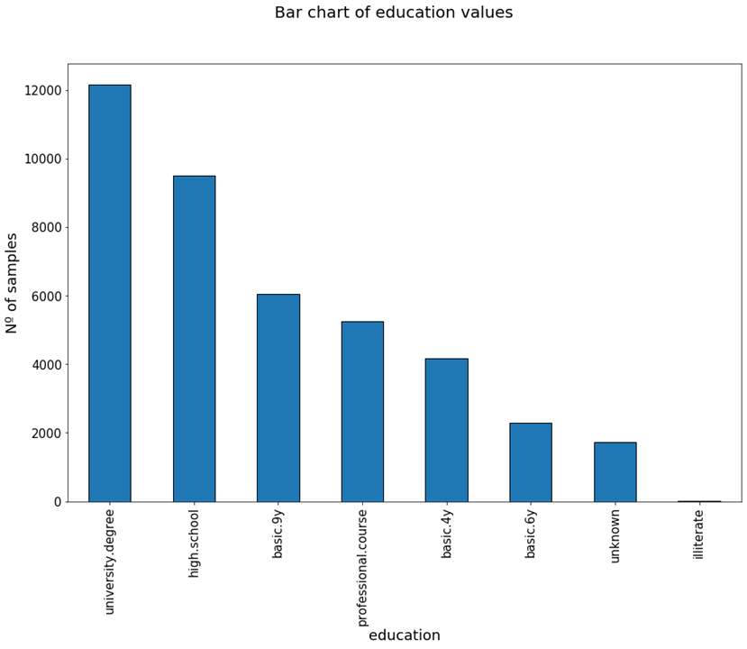
From this plot we can see that most of the targeted persons had an university degree, and very few were illiterate. When creating plots like this, it helps to order the categories from highest to lowest values, as it makes the visualisation more clear.
In this example also, we have included the absolute value of the Nº of samples instead of the % like in the previous target variable example. If we have in mind the number of data points (contacted persons in this case) then it is most helpful to include porcentual values. If not, it can be better to include absolute ones.
One thing to notice from the previous graph is that it is not very easy to read the names of the different categories of the variable. To solve this problem, we can rotate these labels 45º, or we can switch to a horizontal bar plot, like in the following figure.
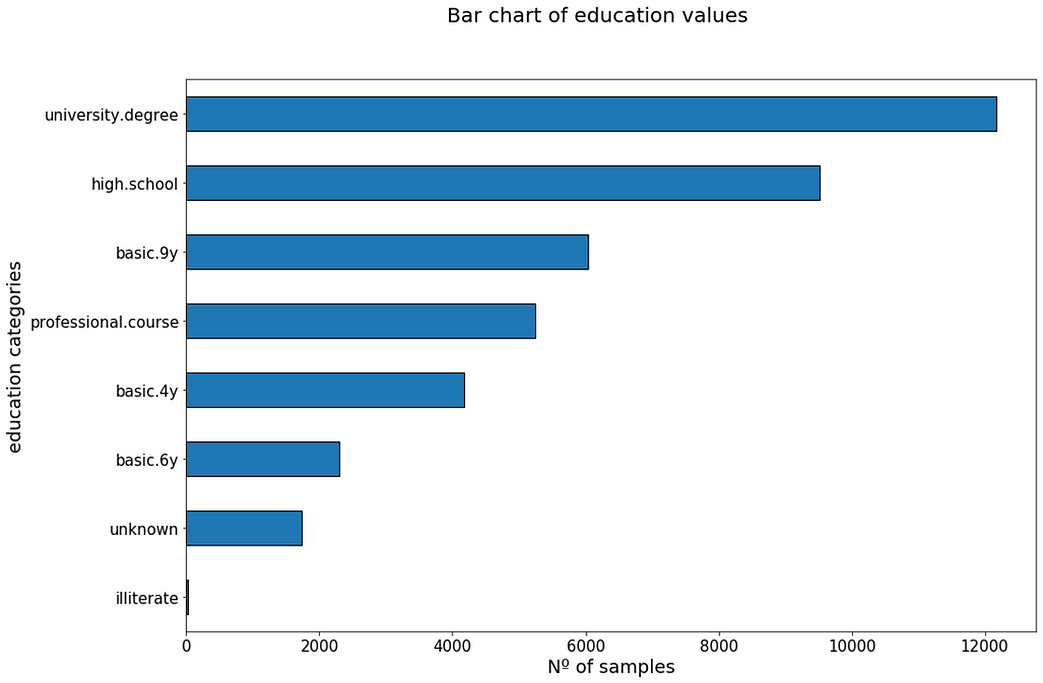
Now we can easily read the labels. Notice also how it is very important to give a tittle to the plots, so that we can easily see what we are talking about, and also to name the axis appropriately. In the first example with the education variable, the axis where it says ‘education’ really shows the different categories for such variable. In the horizontal bar plot, this label has been correctly modified to ‘education categories’.
Lets finish seeing some bar charts corresponding to the ‘job’ variable, which tells us the job category where our impacted customers belong.
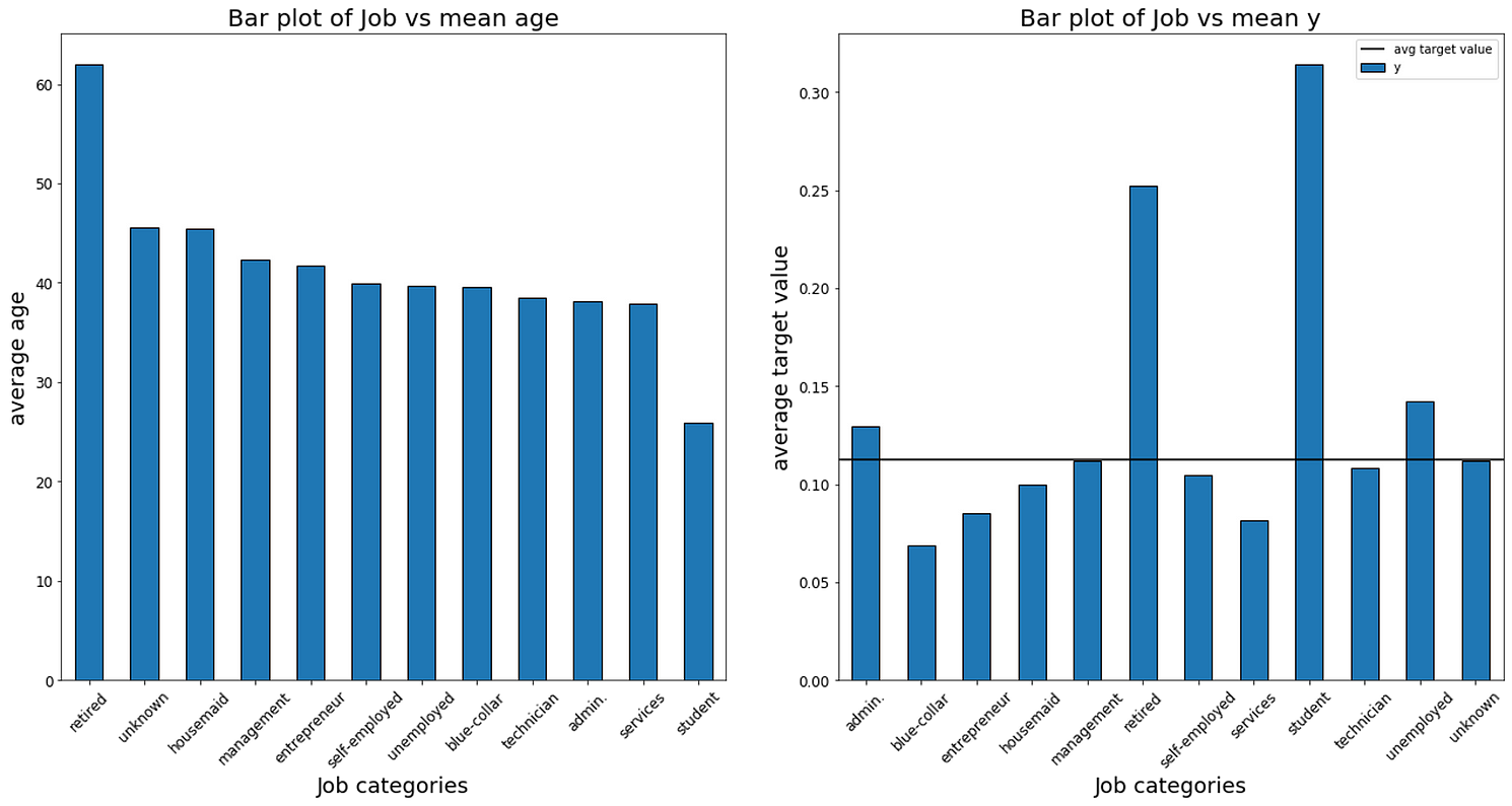
The bar chart on the left represents the mean age of each job category. From it we can see something obvious: retired people have the highest average age while students have the lowest average age.
The graph on the right however, is much more interesting. It reflects the behaviour of each job category with respects to our target variable. As we saw before, about 12% is our average acceptance rate for the marketing campaigns we throw out. This is represented with the horizontal black line on the graph.
The height of each column represents the average acceptance rate for each of the categories of the evaluated variable. As we can see, students are the most likely clients to accept our campaigns, as they have more than double of the standard acceptance rate. Blue-collar workers on the opposite side, are the least likely to accept, with about half of the average acceptance rate. Should we modify our campaigns to increase the capture of these kind of clients?
The following image shows the same plot for the marital variable, which represents the civil status of the targeted person:
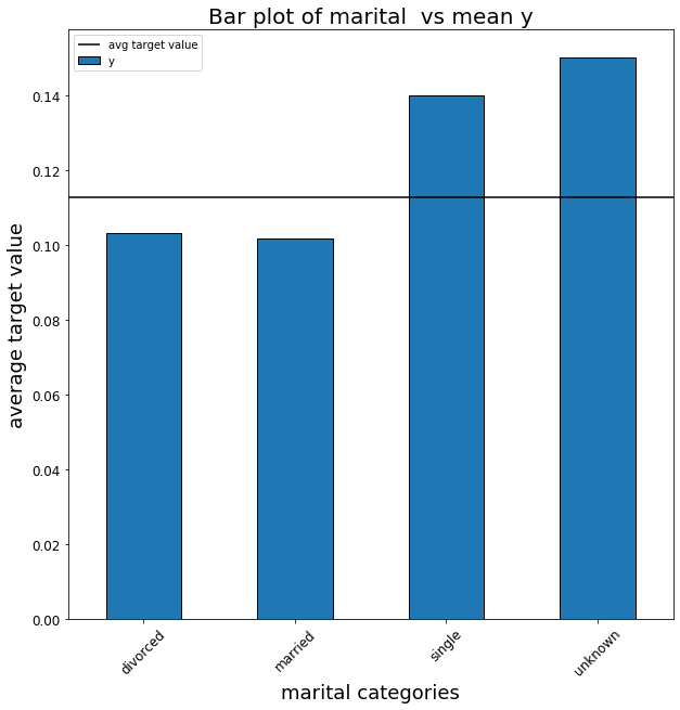
As we can see, people who are single have a higher chance reacting positively to our marketing campaigns than married or divorced people. This could be because they are younger and fall into the student category, that as we saw before also have a high acceptance rate. I will leave this further investigation to the most curious readers.
Bar chart summary: bar graphs are most commonly used to compare a single variable value between different categories or groups. When using bar charts to compare different categories avoid showing a very long list of categories, sort the columns by their height, and consider using horizontal bar charts when your x-labels labels are long.
We won’t worry about the colours too much for now, but they are also important to differentiate the different categories and make the plots more clear.
The 101 of Exploratory Data Analysis – Scatter plots: relationships between numerical variables

Scatter plots are used to determine relationships between two numerical variables. They can help see if there is a direct relationship (positive linear relationship or negative linear relationship for example) between two variables. Also, they can help us detect if our data has outliers or not. If the variables don’t follow any kind of relationship, we might consider doing a transformation of one of them, like converting it to logarithm.
If the data does not have any kind of direct relationship, visualising a scatter plot can help us see some information that would otherwise be hidden. Lets take a look at the following example, that plots a scatter plot of the variables age and duration.
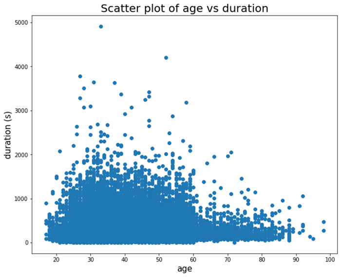
From this plot we can see various things: first of all, very few customers hold calls for more than 2000 seconds. Also it seems like as people get older their patience gets worse and they hang up quicker.
Unfortunately in this data set there are not many continuous numerical values, so we can’t see further real examples of scatter plots. However, imagine we had a data set with characteristics of people like their weight, height, age, sex, profession, etc… If we plotted a scatter plot of height vs weight, we would probably see a relationship like the following
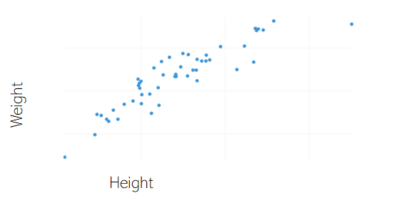
As we can see, the relationship between these two variables is linear, as we’d probably expect: taller individuals also tend to weight more. Again, this just highlights that scatter plots are very useful when searching for the relationship between two numerical variables.
To finish with scatter plots, lets see some good practices. First, it only makes sense to create scatter plots of numerical variables when these are continuous or have a wide range of possible values. Lets see why this is with the following example:
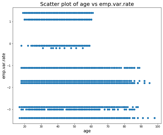
It shows a scatter plot of the age variable with emp.var.rate, which is the employment variation rate. This variable, despite being numeric, only has 10 possible values, so as we can see the plot is not very illustrative.
Scatter plots summary: scatter plots are a great way to visualise the relationship between two continuous numerical variables. Avoid using them when the variable, despite being numeric, has a very limited value range.
Box plots: mean, variance and outliers

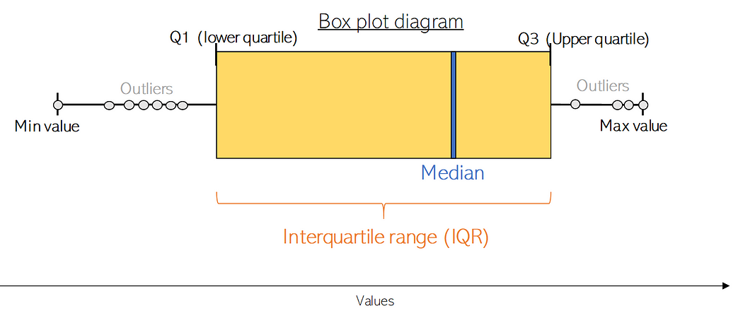
Box plots are a fundamental exploratory data analysis tool, and another way to get information from numerical variables. Specifically they allow us to see the median, standard deviation and variance, and also to explore if there are any outliers on the values of the given variables. Lets first see the information a box plots gives us, and then go to concrete examples from out data set.
Box plots shows us the median value of the data variable we are exploring, which represents where the middle data point is. The upper and lower quartiles represent the 75 and 25 percentiles of the data respectively. The upper and lower extremes shows us maximum and minimum values of our data. Finally, it also represents outliers. The following figure illustrates an standard box plot.
Lets see what these kind of plots can tell us about the two real numerical variables of our data set, age and duration.
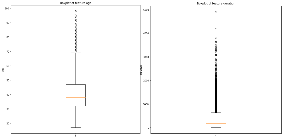
The previous graph shows us a couple of things. First of all, from the one on the right (duration variable) we can see that the length of the calls is generally quite low, being the middle observation at somewhere around 300s of duration. We can also see that the upper and lower quartiles are close to the median value, and that outliers spread until very high duration lengths.
From the one on the left (age variable) we can see that all the outliers we have (values with fall outside the acceptable or normal range of values for a variable) exceed from the top: we are contacting unusually old people from time to time. This might be in line with our marketing strategy or it might be something which we have to check. If we wanted to get a view of the data without any age outliers, we could just filter using the age variable and keep anything under Q3 (aprox 70 years old), and analyse the results we get.
Box plot summary: box plots allow us to quickly see statistical values of our numerical variables, and seamlessly detect if there are any outliers without the need to execute complex algorithms.
Histograms: Bar charts for numerical variables
Histograms show us the frequency distribution of a numerical variable. It builds different group of ranges for the values of such variable, called bins, and tell us the amount of the data that falls within each bin. Kernel density estimation plots are build from histograms, as we can see when we set the number of bins to a very high values. Because of this, histograms can be used to see if a variable follows a normal distribution, and if it does, how skewed it is. We can see this in the following figure.
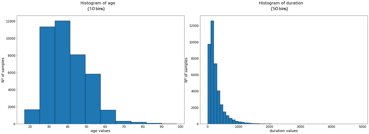
The histogram of the age values shows us that it probably follows a normal distribution, which is a bit skewed to the left, and the same probably happens with duration. As you can see, the more bins we include, the more our plot looks like a proper distribution. If we increase the number of bins for the age variable, we get something like this:
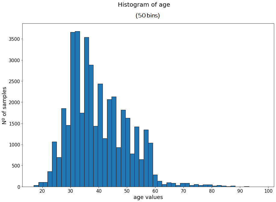
Now, we can more clearly see the shape of the distribution, with a long tail on the right.
The variables don’t have to follow a specific distribution, like we can see in the following example, with the euribor3m variable, which represents the euribor 3 month rate.
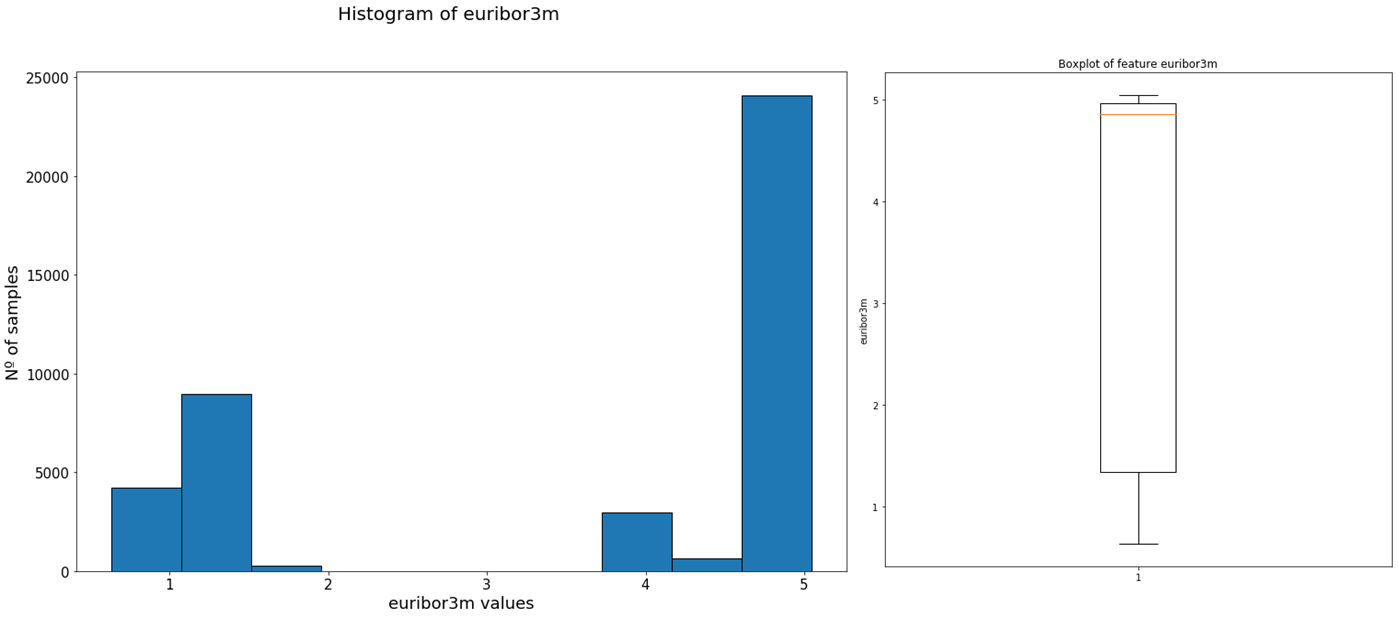
From the histogram we can see that the variable does not follow an specific distribution, but that most samples have values near 5, as we can confirm with the median extracted from the box-plot.
Histogram summary: histograms are like bar charts for numerical variables, where the values of the variable are divided in a series of ranges called bins. They allow us to see the distribution of a certain variable, and they better approximate this distribution as we increase the number of bins.
Heatmaps: Color as a visualisation tool
Heatmaps take a data grid (a matrix, or table for example) and display it using different scales of colour to represent the values in each cell of the grid or table. They use color in the same way that a bar chart uses width and height, as a visualisation tool.
In data analysis, they can be used to visualise the correlation between the numerical values of our variables for example, as shown in the following plot.
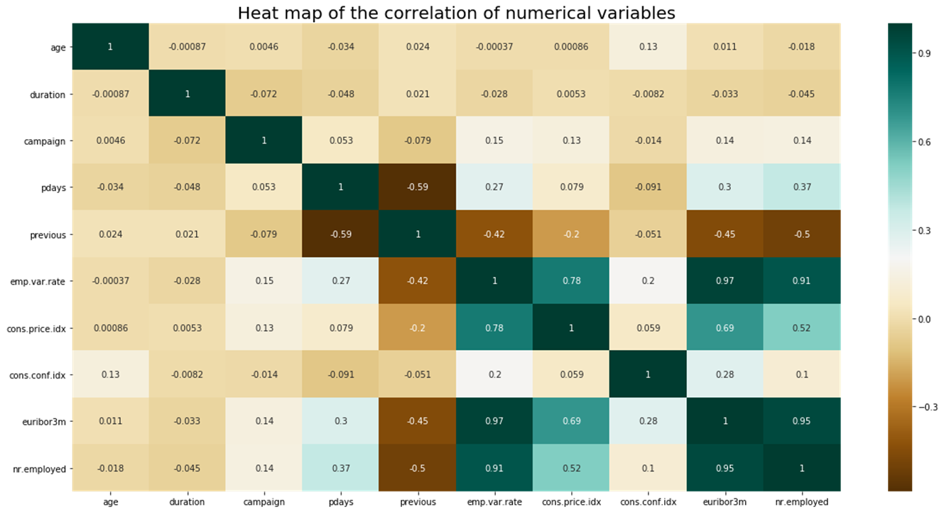
Using this matrix we can see if there are any variables that are correlated, discovering an interesting relationship between the two that we might want to dig into, or we can use it as a way to remove variables that don’t add any additional information to our data for building a Machine Learning model, as a feature selection step.
On the chart each cell represents the correlation between two variables, and the values go from dark brown (strong negative correlation) to dark blue/greenish (strong positive correlation) with lighter colours in between for weaker correlations. This gives us a very quick way to spot correlated variables.
From the previous graph we can see that the euribor3m and nr.employed variables have a very high correlation. We can confirm this by plotting a scatter plot of the two:
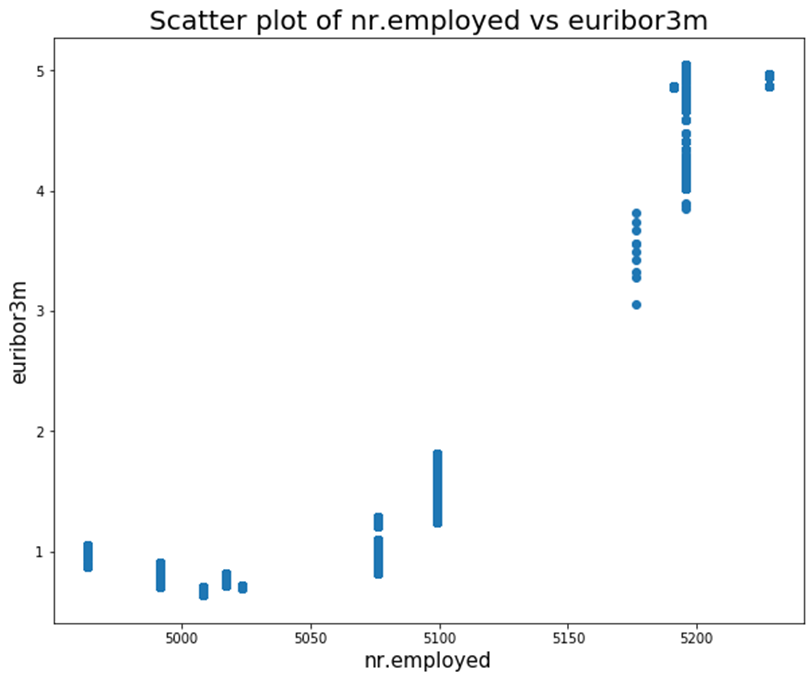
It does seem like these variables have a very strong linear relationship, and further investigation should be done in order to see why this is.
Exploratory Data Analysis: Conclusion
With this, we have finished explaining all the plots for this post on Exploratory Data Analysis (EDA). There are other plots like Line plots and Pie Charts, that could be added, however, they are very simple and most of us know how they work without the need for an explanation.
Using the visualisation tools covered to analyse the different variables of our data and their relationships, a lot of useful information can be derived that can be useful both from an initial business perspective, and a model building posterior point of view.
We have also summed up some of the best practices for plotting: it is important that we know when to use each of the visualisation tools at our disposal, and how to carefully optimise what we display in these plots.
Lastly, it is also important to have more than just plotting capabilities: we must be able to read these plots and extract useful information from them; a plot from which nothing can be obtained does not help anybody.
If you want the code for any of the plots on this post, please feel free to leave us a comment and we will send it to you.
Additional Resources on Exploratory Data Analysis (EDA)
In case you want to dig deeper and develop a more profound practical and theoretical knowledge of Exploratory Data Analysis, check out the following resources.
- Exploratory Data Analysis for Natural Language Processing.
- Review of the book ‘Python for Data Analysis’
- Data sets for your own Data Analysis projects.
Also, check out our section on Data Analysis Books, where you will find resources to learn all this and more!
Subscribe to our awesome newsletter to get the best content on your journey to learn Machine Learning, including some exclusive free goodies!
